Few corporate symbols are as instantly recognizable as the green siren that marks a cup, a storefront, or a sleeve around the world. The evolution of the Starbucks logo is a case study in how history, mythology, craftsmanship, and pragmatic branding choices combine to create an icon. This deep dive traces the siren’s path from an old seafaring woodcut to today’s pared-back emblem, explains the design choices behind each redesign, and shows how a local coffee brand transformed a mythic image into global shorthand for a cup of coffee.
Table of Contents
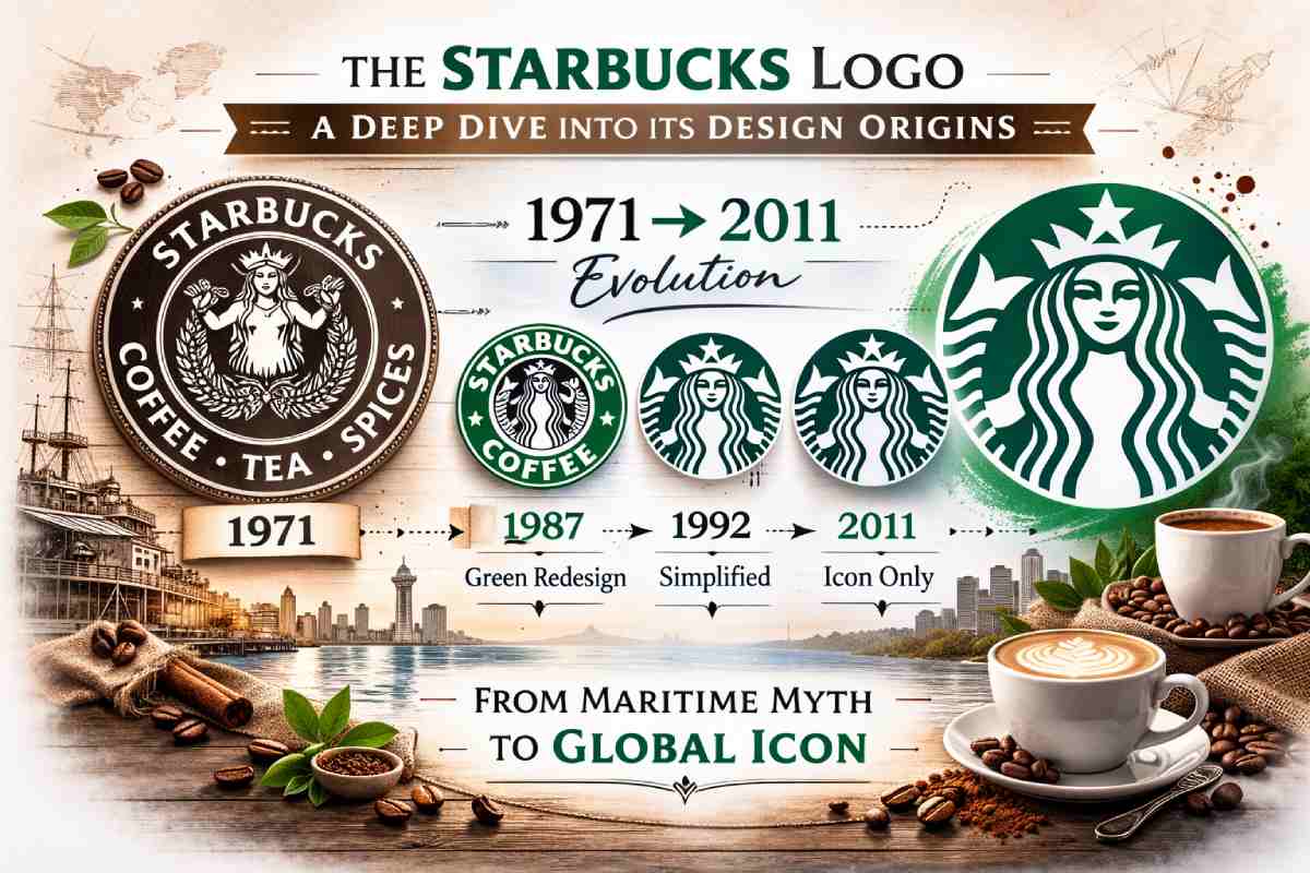
Quick timeline
![]()
- 1971: The original brown circular badge with a detailed, twin-tailed siren and the words “Starbucks Coffee, Tea, and Spices” (designed by Terry Heckler).
- 1987: Il Giornale / Howard Schultz era — green replaces brown, the type lockup shortens to “Starbucks Coffee”, and the siren is modernized.
- 1992: The logo tightens the crop to focus more on the siren’s face and upper body, further simplifying details.
- 2011: The wordmark is removed; the siren stands alone as the brand mark in green.
Where the siren came from: research, myth, and the designer
The brief and the search
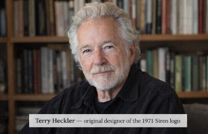
When the founders of Starbucks opened their first store in 1971 near Seattle’s Pike Place Market, they wanted a logo that felt rooted in the seafaring history associated with coffee trading. Gordon Bowker and his partners asked local designer Terry Heckler to find nautical imagery that fit the brand’s story. Heckler scoured old marine books and found an image that inspired the mark he would adapt for the original logo.
The woodcut & mythic inspiration
Heckler’s starting point has often been described as a 16th-century woodcut (sometimes called “Norse” in retellings) depicting a two-tailed mermaid or siren. That twin-tailed motif — which appears in older European iconography and folklore (and which some sources link to the Melusine figure) — resonated for its maritime associations and visual drama. Heckler reworked the art into a circular, brown badge that read “Starbucks Coffee, Tea and Spices,” pairing the exotic, slightly gothic siren image with a clear, utilitarian wordmark.
Short takeaway: the siren was chosen as a metaphor — the “siren song” of coffee — and for local flavor: Seattle’s port city identity and the idea of exotic beans arriving by sea.
The original 1971 mark: detailed, local, and slightly risqué
Open an image of the 1971 badge, and you see a highly detailed engraving-style siren. She is topless (a detail later softened), with two prominent tails fanned around her. The brown color reflected the coffee/earthy palette, and the circular seal style felt artisan and old-world — a good fit for a specialty coffee roaster and retailer that began by selling beans and spices. This logo was both narrative (it told a story) and tactile (it looked like something pulled from an old mariner’s ledger).
Why brown?
Brown read as “coffee, natural, artisanal” — a calm, grounded choice that matched the company’s early pitch as a purveyor of specialty beans, not a high-street café chain. The circular badge resembled old seals and emblems, lending the brand an air of heritage from day one.
1987: green, growth, and the Il Giornale moment
In 1987 Howard Schultz (who had earlier founded Il Giornale) acquired Starbucks and brought a new growth mindset. The siren stayed, but the visual system shifted. Designer Terry Heckler revisited the logo to modernize it for wider retail usage: the logo switched from brown to green (a color associated with growth, freshness, and global reach) and the wording around the circle condensed to the more marketable “Starbucks Coffee.” The siren’s hair was repositioned to be less revealing—a practical change as the brand prepared for broader, family-focused marketing and physical signage.
Why green?
Green signaled a fresh brand personality, a broader retail orientation, and visual consistency across signage and packaging. It also differentiated the mark from the brown of traditional roasters and positioned the brand for expansion into cafés and consumer product aisles.
1992: cropping and simplification — the siren’s face becomes central
By 1992 the brand designers recognized the siren’s potential as a standalone symbol. The mark was tightened — details were simplified, and the crop moved in so the siren’s face and upper torso dominated the badge. This made the logo more legible at smaller scales (cups, sleeves, signage) and created a friendlier, less mythic look — the character became warmer and more iconic, less forbidding. The siren’s twin tails remained implied, but the emphasis shifted squarely to her face and crown.
2011: global icon — words removed
For its 40th anniversary in 2011, Starbucks removed the wordmark entirely. Why? The siren had become so recognizable that the company judged it could stand on its own. The 2011 redesign simplified line work further and expanded the green field so the siren was fully central without any surrounding text — a confident move that showed the brand had the cultural reach to be identified by symbol alone. The decision reflected global scale: the company no longer needed English copy on every store sign; the mark itself carried brand recognition.
Design thinking behind each simplification (practical branding lessons)
If you parse the four major redesigns — 1971, 1987, 1992, 2011 — you can see recurrent, practical branding decisions at work:
- Legibility at scale — early designs were detailed but hard to reproduce cleanly at small sizes (sleeves, lids). Simplification increased clarity.
- Audience & context — the topless, mythic 1971 siren worked in small artisan circles; mass retail required a friendlier, family-safe image. Hence hair repositioning and cropping.
- Color shift as a strategic signal — brown said “roaster”; green said “brand, growth, global.” Color can reposition a brand’s promise.
- From wordmark to icon — when a visual mark outgrows the need for names, the brand is strong enough to live as a symbol alone — a milestone in brand maturity.
The siren’s symbolism: myth, maritime history, and marketing
The siren is more than a pretty face — she carries layered meanings that made her useful to the founders:
- Maritime roots: Coffee’s commercial history is tightly connected to seafaring and ports; Seattle’s identity as a port city resonated with nautical imagery.
- Siren as metaphor: The “siren song” idea — coffee as something that draws people in — was a clever brand narrative that aligned product with myth.
- Ambiguity & allure: Early versions leaned into the slightly dark, seductive connotations of sirens; later versions softened those edges for mass audiences.
A useful design lesson: choose a symbol that connects logically to product origins, but be prepared to adapt how that symbol is presented as your audience broadens.
The contested origin stories: Melusine, woodcuts, and design mythmaking
Over time, scholars and commentators have debated the siren’s precise origin — is it a Melusine, a 16th-century Norse woodcut, or an interpretation of an older European engraving?
- Starbucks’ account points to Heckler’s search through maritime books and a found woodcut foundation.
- Academic notes point out references to illustrations collected in symbol compendia such as Cirlot’s Dictionary of Symbols and suggest multiple possible antecedents.
The upshot is the same: Heckler found a visual anchor in historic maritime imagery and reworked it for the brand. The exact academic lineage is interesting to historians, but from a branding perspective, the myth and her mariner link is what ultimately mattered.
Cultural reception & controversies
The siren has also provoked commentary. In early years the topless depiction drew eyebrows; in later years some observers responded to the logo’s sexualized roots, while others praised the brand for its storytelling. The slow redesigning (hair repositioning, cropping) shows how brands respond to cultural norms and market sensitivities.
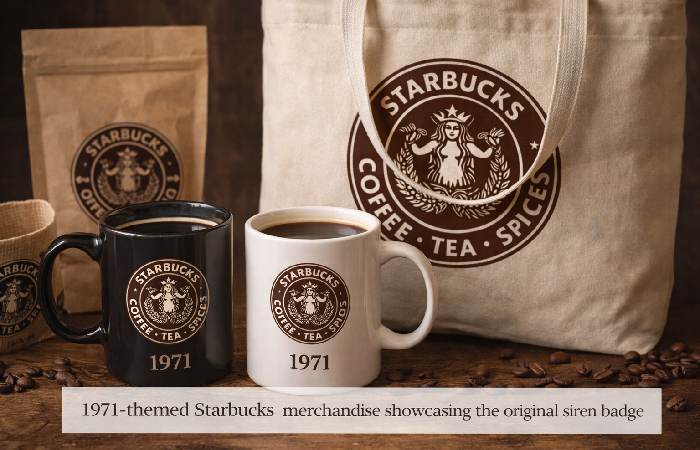
At the same time, the siren’s ubiquity has made the symbol a cultural shorthand — parodies, pop culture mentions, and retro product lines (for example, 1971-themed merch) all reinforce the logo’s cultural footprint. Recent merchandise celebrating the original 1971 design demonstrates how brands can repurpose their own history for marketing.
Practical takeaways for designers & brand teams
- Start with a story, but design for scalability. A textured, story-rich symbol is great — but test it at real sizes early and often.
- Use color to reposition. Moving from brown to green signaled a new brand ambition. Colors are brand architecture tools.
- Simplify thoughtfully. Each simplification of the siren increased clarity while preserving the core idea. Keep the essence, drop the clutter.
- Lean into cultural evolution. Logos must live in changing social contexts — modesty, global recognition, and local sensitivities matter.
FAQ
Q: Who designed the original Starbucks logo?
A: Local designer Terry Heckler designed the original 1971 siren badge.
Q: Where did the siren image originate?
A: Heckler’s inspiration came from old maritime books and a historic woodcut with a twin-tailed mermaid motif; links to Melusine and older woodcuts are commonly cited.
Q: Why did the logo change colors from brown to green?
A: In 1987, during brand expansion under Howard Schultz and Il Giornale, green was chosen to signal growth, freshness, and global aspirations.
Q: When did the wordmark go away?
A: In 2011, the wordmark was removed and the siren was used as a standalone icon — a move reflecting the brand’s global recognition.
Final thoughts: what the siren story teaches about identity and scale
The Starbucks logo journey — from an old seafarer’s engraving to a minimalist global emblem — is a masterclass in brand evolution. It shows how a brand can start with a richly narrative anchor, then progressively refine that anchor for clarity, cultural fit, and global recognition. The siren works because it is tied to the origin story, is visually distinctive, and can be simplified without losing meaning. That combination is rare and powerful: a symbol with deep roots and modern flexibility.